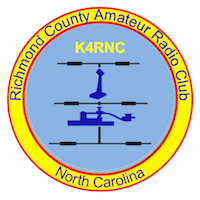
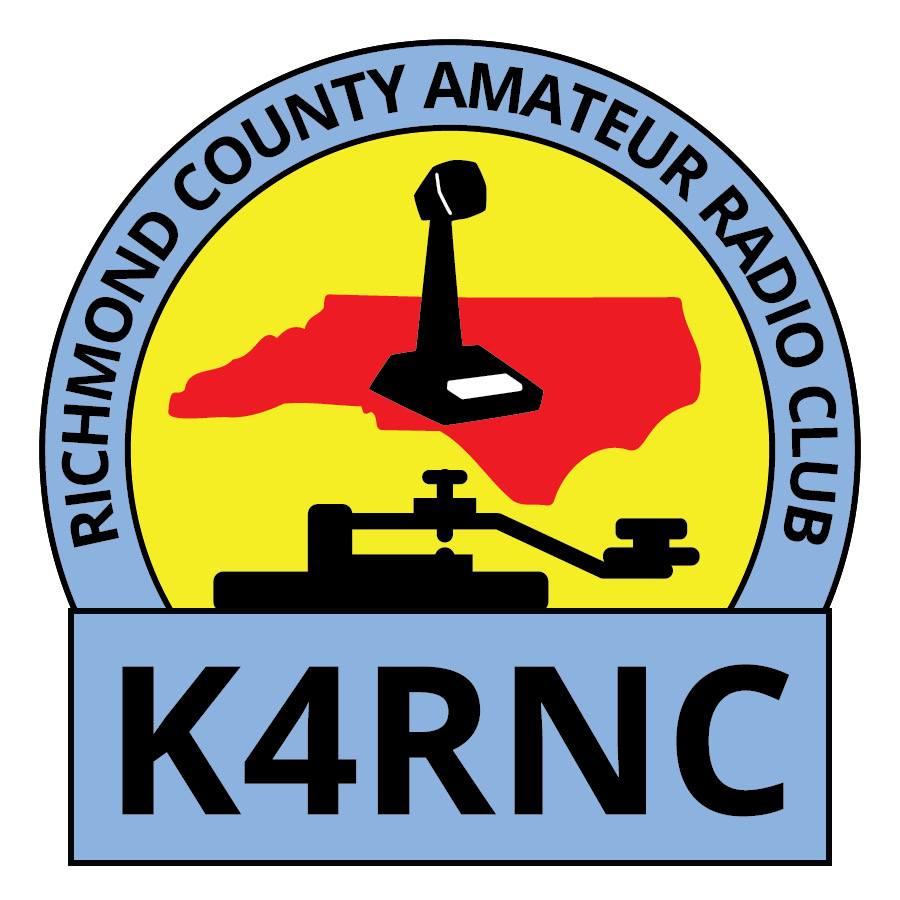
During the August Club meeting, Mike KA4AMP proposed an update to the club logo. The revised logo honors key elements of the current logo while increasing readability at all sizes. The logo update also addresses the need for a file format that is ready for print and scalable.
The proposed logo is already in a vector format required for screen printing and embroidery and is presently available in three variations: color, grayscale and black and white.
The club voted to take the logo update under consideration to review and discuss for a month.
The club Facebook is a useful place for discussion. Suggestions or questions about the revision can be sent to Mike, KA4AMP@outlook.com.
| Current Logo | Proposed Revision: 3 variations Color , Black & White, Grayscale |
 |  |
 | |
 |


3 thoughts on “Club Logo Update Under Consideration”
I like the new logo in color. Easy to read.
Thanks for the feedback. If adopted, the logo would be available in all three versions: color, black and white, grayscale, for various applications.
I like the new logo.